01 | Object record · Facts
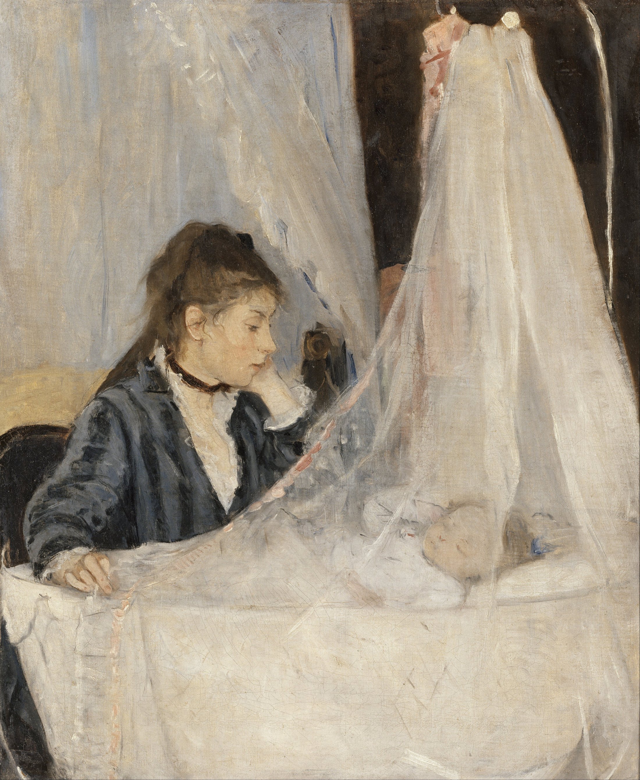
Le Berceau (The Cradle) was painted by Berthe Morisot in 1872. It is oil on canvas, 56 × 46.5 cm, now in the Musée d’Orsay, Paris, accession RF 2849. The sitters are Morisot’s sister Edma and Edma’s sleeping daughter Blanche.
The museum identifies it as Morisot’s first treatment of motherhood, a subject she would revisit. She showed the painting at the first Impressionist exhibition in 1874, becoming the first woman to exhibit with the group. Barely noticed and unsold, it remained with the sitter’s family until its acquisition by the French national museums in 1930.
02 | Begin with the diagonal
This is not merely a soft mother-and-child scene. Its tenderness is held under tension by a firm diagonal. Edma’s lowered gaze begins the movement; her bent left arm carries it downward; the child’s similarly folded arm receives it; the curtain behind them continues the same slant. Three separate gestures behave like one quiet seam joining two bodies.
The canvas is almost split in two. On the left: a dark, awake, vertical figure. On the right: pale, sleeping, expanding fabric. Neither cradle nor child is fully disclosed. That obstruction is not missing information—it produces the intimacy. We are allowed to approach, but not to possess the moment.
Two triangles answer each other. The mother’s face and forearm form a weighted, dark wedge; the veil spreads into a luminous, nearly transparent one. One bears weight, the other filters sight. The stillness comes from their opposing forces reaching equilibrium.
03 | White is never only white
At first the palette appears almost colourless. Stay with it and the whites separate: cool blue-grey gauze, warm cream bedding, muted rose skin, and a dress closer to olive-charcoal than absolute black. Morisot works with low-chroma temperature contrast. Hue differences remain narrow, yet the warm skin is enough to emerge from the cooler fabric.
The brightest notes do not converge on a face. They scatter across veil, bedding, and cuff. Light seems sifted through cloth—no theatrical beam, only soft interior diffusion. The dark sleeve acts as a visual anchor; without it, the pale field would drift away.
Suggested editorial ratio: 55 / 20 / 12 / 8 / 5. Visual approximation, not conservation data.
04 | Stop the brush at “just visible”
Morisot does not turn the veil into a hard sheet of white paint. Thin, quick, pale strokes permit the underlayer to show through. Edges sharpen, then dissolve. Transparency is made through the ratio of coverage to omission, not by describing every thread. The child’s face and hand are relatively resolved; fabric and background remain open and mobile. Uneven finish becomes a focusing device.
This is another possibility for Impressionist painting indoors. Instead of sunlight flickering over a landscape, visible brushwork records how diffuse light travels across different surfaces. Ribbon, skin, cotton, and gauze share a family of greyed whites, yet separate through stroke density and edge softness.
05 | More than a painter of “tenderness”
Berthe Morisot (1841–1895) was a central Impressionist and participated in seven of the group’s eight exhibitions. She repeatedly painted women, families, and interiors.
These subjects should not be mistaken for limited ambition. Within the social constraints of nineteenth-century life, they were the modern world she could observe at sustained, intimate range. She made supposedly private experience into rigorous problems of looking, space, and time.
Edma looks quiet and attentive, but possibly tired or absorbed in thought. The facts cannot tell us exactly what she feels. Morisot’s refusal to settle the expression preserves Edma as a person with interior time, not simply an emblem of “mother.”
06 | Why it moves us · Interpretation
It makes love visible as attention rather than action.
There is no embrace, no exchanged gaze, no narrative climax. A woman watches; a child sleeps. Yet the diagonal running through eye, arms, and curtain gives protection a structure.
The veil is an almost weightless boundary: sheltering the child while keeping the viewer outside. The less it reveals, the more clearly it says that intimacy is not display but the precise care of distance. The painting’s sweetness therefore carries an adult restraint. Love does not always have to arrive; sometimes it simply remains nearby.
07 | Translate it into your own image
- Composition: Place a dark figure in roughly 40% of the frame and a pale subject in 60%. Connect gaze and gesture with an implied 25°–35° diagonal.
- Palette: Use 75% varied warm/cool off-whites, 12% charcoal, 8% muted rose, and 5% olive umber. Avoid absolute white and black.
- Photography: Diffuse window light through gauze. Let fabric hold the brightest highlight rather than the face.
- Illustration and layout: Keep one edge precise and allow another to dissolve. Reserve 15%–20% calm negative space.
