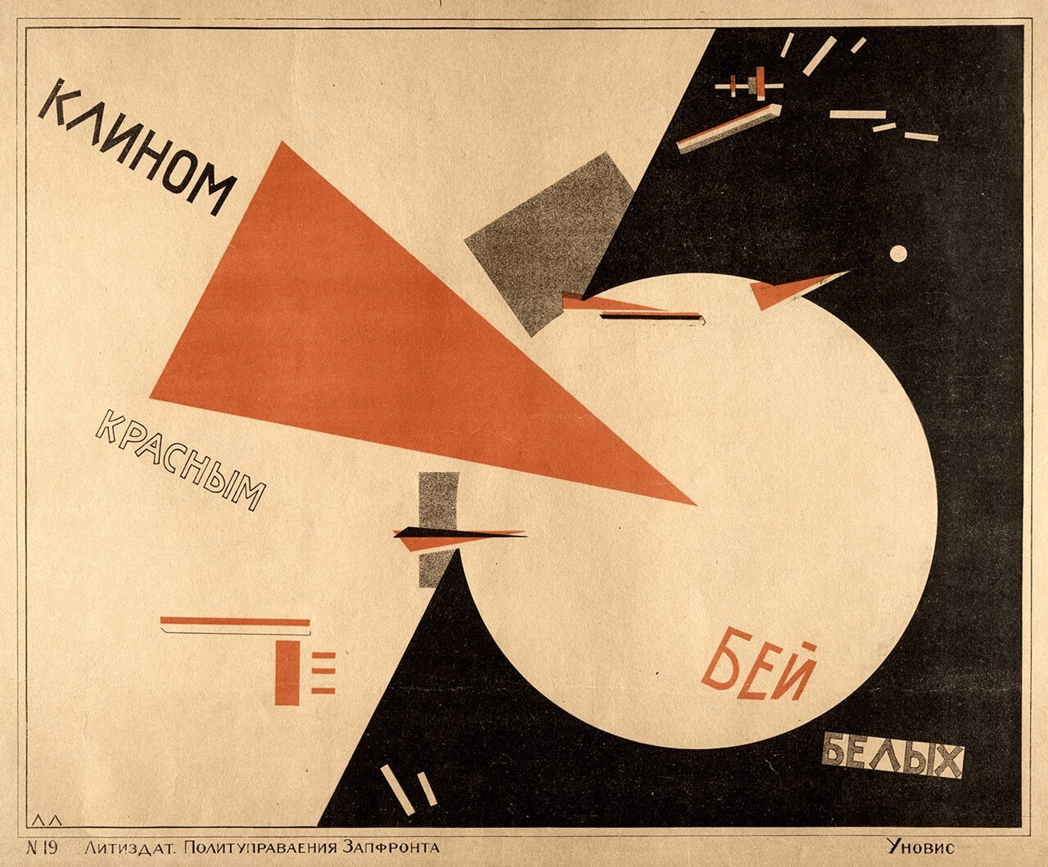
Every force converges on one point
The largest triangle advances from upper left to lower right, its tip lodged in the rim of a circle. The wedge is directional; the circle is closed. One penetrates, the other resists. Their point of contact sits above and right of center, preventing emblematic symmetry.
A coal-black field slices down the right side and compresses the disc. Broad paper on the left gives the wedge its run-up. Small bars and secondary triangles behave like debris from impact. Angled lettering follows the force lines, so typography joins the event.
Not merely “red and black,” but two contrasts
Vermilion and aged paper share warmth, but the red carries greater chroma and leaps forward. Value adds a second contrast: near-black makes the disc appear brightest, while the wedge remains legible across both pale ground and white form.
This is controlled high contrast: 70% low-chroma paper steadies the field, 20% black gives weight, 8% red performs the action, and 2% gray mediates. Scarcity makes each red appearance imperative; grain and fading keep the pressure tactile.
No depicted light, yet clear space
Volume is not modeled by realistic illumination. Saturated red seems nearest, black recedes, and the pale disc reads like a lit plane. Gray bars briefly occupy the middle distance. Light has become value structure: the eye identifies what is brightest and heaviest, then infers what strikes what.
Print limits become visual syntax
Collection records generally describe a color lithograph on paper. Few colors, hard silhouettes, and reproducible geometry make the message work at distance. Black grain, shifting red ink, and printed edges stop the work from becoming a frictionless contemporary vector graphic.
Fact: Lissitzky trained in architecture. In late 1919 he began teaching in Vitebsk, where he encountered Kazimir Malevich and Suprematist form. He redirected abstract planes toward posters, books, and typography. A Museum of Modern Art poster history places this design among the earliest completely abstract posters.
Why it moves: comprehension precedes reading
The Russian Civil War is the historical setting: the red wedge signifies the Bolshevik Red Army, and the white disc the White forces. This is political propaganda. Formal admiration need not equal political endorsement. The enduring lesson is how drastically conflict can be compressed into a visual sentence.
The affecting passage is the millimeter where point meets circumference. The whole poster concentrates on that tiny contact. Impact does not require abundance: direction, area, value, and empty space can pronounce one verb at once. Context and object data are sourced facts; the formal and emotional reading is Daily Art's analysis.
A practical formula to borrow
- Palette: #E8D1A6 70% + #171310 20% + #C94E2F 8% + #746655 2%.
- Composition: pair one large directional form with one closed form; collide them at an eccentric 60–70% point.
- Typography: rotate the main line 12–18° along the dominant force; keep secondary text brief.
- Outfit: beige coat + straight black base + one vermilion accessory; keep red near 5–10%.
- Exercise: solve weight in black and white, then add one high-chroma accent for one action word.
