Do not look for the ball just yet
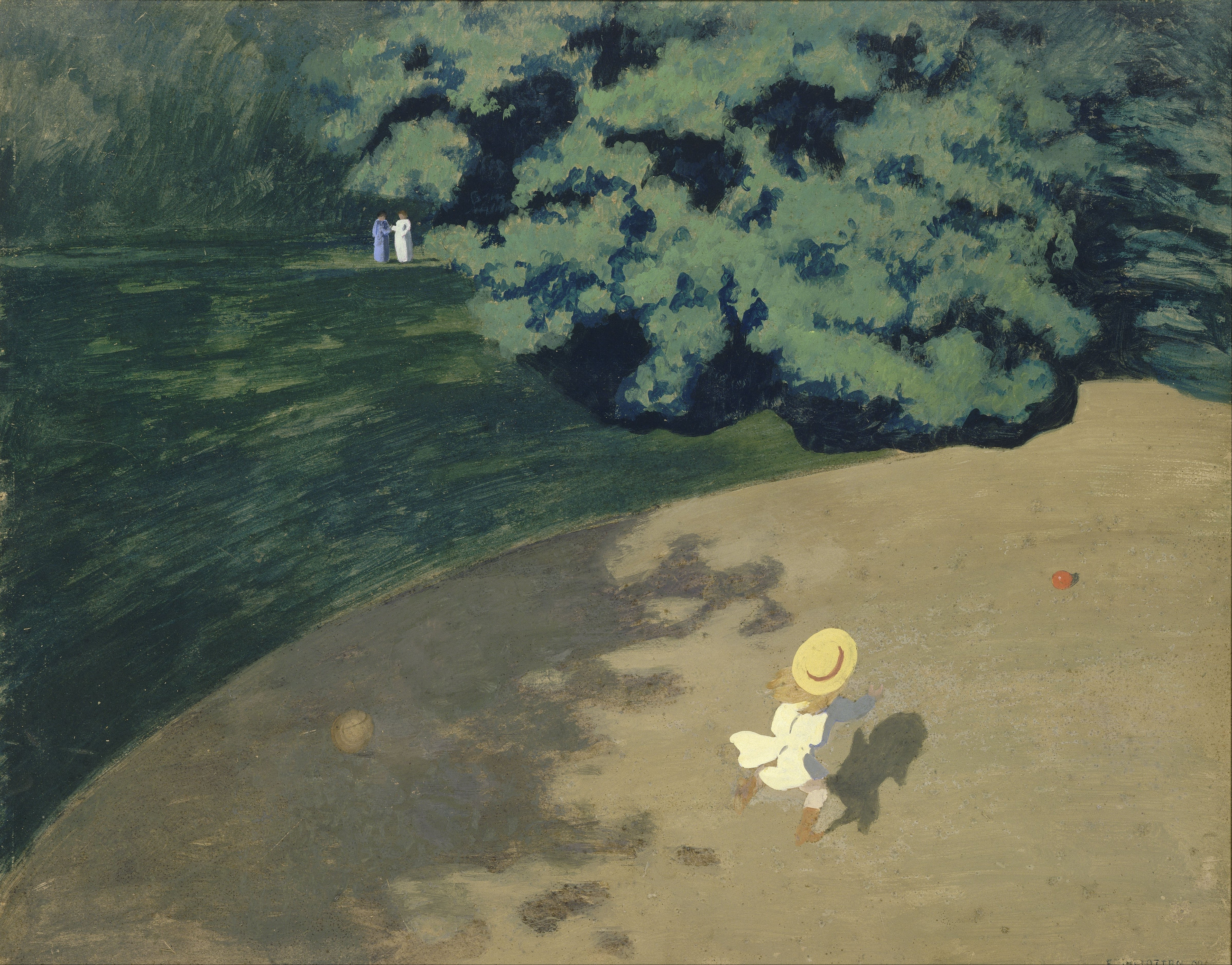
First comes an almost empty expanse of ochre. Then a child rushes in from below; the red ball is barely larger than punctuation. Two women in the distance are reduced to strokes of blue and white. Vallotton does not place “the charming child” at the center. He centers distance: between child and ball, child and adults, viewer and ground.
The museum identifies the bird’s-eye view and notes that scale implies depth while the space remains flat and frontal. That slight spatial wrongness turns a game into a dream—and a suspense scene.
Composition: four wedges push the eye toward red
There is no conventional horizon. Tree shadow, grass, and pale path interlock like cut paper. A dark arc presses from above; light ground opens diagonally into a channel. Child, shadow, and ball land in sequence along it. Since the child faces away, movement becomes the painting’s only unambiguous arrow.
The distant women and child form a narrow triangle that stabilizes the negative space. Their presence opens the story: is the child running away, or toward them? The ball sits off the child’s axis, so action slides beyond the frame.
Color: mute the field so one red note can speak
Ochre, moss, ink green, and smoke blue create a low-saturation analogous harmony. Warm white separates the child through value contrast. Vermilion makes a controlled red-green complement with the field. It occupies less than one percent of the surface but carries the greatest visual weight. Red returns in the hat ribbon, tethering child and ball.
Light: the shadow arrives first
Sunlight is not soft atmosphere. It is edited into hard planes of brightness and dark. The child’s shadow races ahead like a second, faster body; the canopy shadow enters with a scalloped edge. Light cuts the surface instead of modeling volume. In another second the child will enter shade, and the ball may leave the frame. Bright afternoon acquires unease.
Technique and artist: a woodcut blade inside oil
Born in Lausanne, Vallotton (1865–1925) moved to Paris in 1882. He forged his graphic language through woodcuts in the 1890s and associated closely with the Nabis. Printmaking trained a method: compress complexity into black and white masses, make contour carry narrative, and remove detail until only the necessary remains.
Although painted in oil, The Ball behaves like a color woodcut. Brushwork does not perform; edges are decisive and shapes compressed. The Nabis’ flat form, a high viewpoint associated with Japanese prints, and daring cropping become a cool, exact way of watching.
Why it moves us
The child does not know we are watching; we do not know who the women are. We have a godlike view without narrative certainty. That gap—seeing more while knowing less—feels strikingly modern. The ball is tiny, yet gives the whole field direction. Childhood joy becomes fragile: always a little farther ahead, always asking us to keep running.
Borrow the system
- Layout: 70% low-saturation field + 25% irregular dark plane + 5% high-value subject; keep the saturated accent to 1%–3%.
- Palette: 55% ochre + 25% moss + 15% ink green + 4% warm white + 1% vermilion.
- Outfit: moss jacket + oat trousers + warm-white top + one vermilion bag.
- Photography: shoot from above, place the figure in the lower third, preserve empty ground, and point the cast shadow into the movement.
Sources, facts, and rights
- Musée d’Orsay object record: object facts and museum interpretation.
- The Metropolitan Museum of Art exhibition record: artist and printmaking context.
- Wikimedia Commons / Google Art Project file: source of the local image; marked Public Domain.

Object facts derive from museum and exhibition records. Readings of composition, color, light, and emotion are original analysis by Daily Art. Rules for faithful reproductions differ by jurisdiction; verify local requirements before reuse. Image copyright belongs to the artist and relevant rights holders.