The Great Wave off Kanagawa
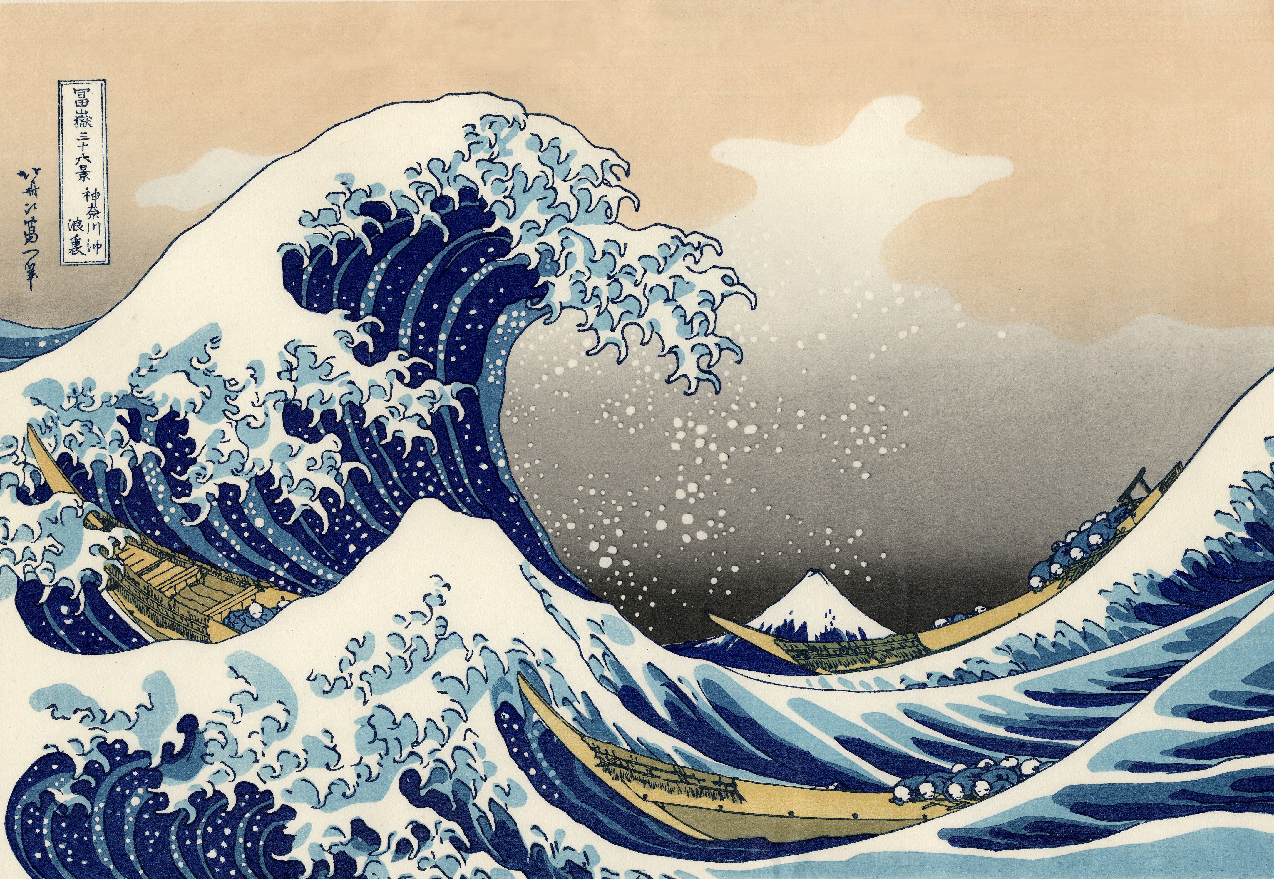
A wave is frozen forever in the instant before it breaks. Foam claws reach into the sky, three boats vanish into the trough, and sacred Mount Fuji shrinks to a small quiet triangle at the heart of the swell. This isn't a picture of the sea — it's a picture of power and fragility, and the most reproduced shade of blue on Earth.
01 Composition
The whole image is one enormous asymmetric triangle: the crest rears up on the left and lunges right, shattering into a row of claw-like foam fingers — a living thing about to strike. The diagonal of the trough drives your eye to the center, to Mount Fuji.
The masterstroke is a visual rhyme that's also a reversal: the white triangle of Fuji's distant peak is swallowed, echoed and magnified by the near foam. Through forced perspective, Hokusai makes the eternal sacred mountain smaller than a fleck of spray. The curl approximates a logarithmic (golden) spiral, and the foam breaks into smaller waves, then smaller still — a self-similar, fractal structure that keeps the frozen image churning. A low horizon and wide empty sky compress the tension to the last second.
02 Colour & Theory
The soul of this image is a blue — Prussian blue (bero-ai / "Berlin blue"): a synthetic pigment newly imported into Japan via China, brighter, more stable and fade-resistant than traditional indigo — and cheaper. The whole Thirty-Six Views series was marketed on this bold imported blue.
Palette logic = near-monochrome blue + warm neutral. From inky base, to mid-blue, to pale spray, it's a stack of analogous values; the only cool/warm tension comes from the warm cream sky and ochre hulls — a restrained complementary play. The gradients are hand-wiped via the bokashi technique, and the bare paper itself becomes the foam — cleaner than any white pigment.
03 Light & Mood
Ukiyo-e doesn't use Western chiaroscuro. No cast shadows, no fading gloom — just flat color fields and a crisp outline (the key block). The "light" lives in two places: the glowing cream sky and the patches of pure white foam.
A faint warmth near the horizon reads as early morning, yet the whole feels cold, alert, breath-held. Because it's flattened, the shape of the wave is pushed to its limit — this is design, not realism.
04 Technique & Medium
This is a nishiki-e (polychrome woodblock) print, published c. 1831 by Nishimuraya Yohachi. It wasn't made by one hand but by a team: Hokusai drew the design; a carver cut the outline block plus a separate cherry-wood block per color; a printer hand-rubbed each layer with a baren, using kentō registration marks to keep colors aligned.
It was a mass-produced, affordable commercial print — the same blocks pulled thousands of impressions (early pulls are sharpest). That's why it traveled so widely; the Met, the British Museum and many others each hold their own. It's small: about 25.7 × 37.9 cm.
05 Why It Moves Us· Hokusai
What moves us is the instant before the break — the wave at its peak, not yet falling, tension maxed out. It's the contrast: tiny people and boats against an overwhelming sea, with even sacred Fuji demoted to a bit player — a deeply Japanese meditation on impermanence (mujō) and mono no aware. And the silhouette is so simple and strong the whole world reads it instantly.
Katsushika Hokusai (1760–1849) of Edo called himself the "old man mad about painting." Said to have made over 30,000 works, changed his name ~thirty times, and moved house nearly a hundred times, he created this series in his early seventies — and claimed he wouldn't truly master art until 110. The print shaped Western Japonisme (Monet, Van Gogh), inspired the cover of Debussy's La Mer, and appears on Japan's 2024 ¥1,000 banknote.
06 Steal This Palette
- Hokusai's colour formula: deep Prussian blue (60%) + cream/oatmeal (30%) + camel/ochre accent (10%), with clean white as the "foam" highlight.
- In an outfit: essentially denim blue + cream + tan — endlessly wearable. For graded depth, layer blues of different values (navy coat / mid-blue knit / pale-blue shirt) — the bokashi gradient, worn.
- Why it works: one family of analogous blues = calm; a single warm neutral = breathing room inside the cool; generous white space = it lifts the whole, just like the spray.
- For design: near-monochrome cool + one warm anchor reads quiet but with contrast. And like Hokusai — leave bold empty space so the main shape can speak.